
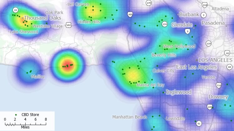
Heat maps are graphical representations of data that use color to indicate the relative magnitude of different values. They are commonly used in data visualization to represent data that has a spatial component, such as geographic data.
Introduction
- A heat map is a graphical representation of data where individual values are represented as colors.
- It is used to visualize data that has a spatial component, such as geographic data.
- Heat maps can be used to quickly identify patterns and outliers in the data.
How Heat Maps Work
- A heat map uses color to indicate the relative magnitude of different values.
- Typically, a color scale is used to map values to colors, with the lowest values represented by cool colors (such as blue or green) and the highest values represented by warm colors (such as red or yellow).
- The data is typically displayed as a grid, with each cell in the grid representing a single value.
- The color of each cell is determined by the value it represents, using the color scale.
Applications
- Heat maps are commonly used in data visualization to represent data that has a spatial component, such as geographic data.
- They can be used to represent data from a variety of sources, including weather data, crime data, and population data.
- Heat maps can also be used in the field of bioinformatics to represent data from genetic studies.
Creating a Heat Map
- There are a variety of tools and software packages available for creating heat maps, including Excel, R, and Python.
- The process of creating a heat map typically involves loading the data into the tool or software, selecting the appropriate color scale, and creating the map.
- Some tools and software packages also allow for customization of the map, such as adding labels or changing the size of the cells.
Interpreting a Heat Map
- When interpreting a heat map, it is important to pay attention to the color scale and any labels or annotations that may be included.
- The color scale should be used to determine the relative magnitude of different values.
- Patterns or outliers in the data can be quickly identified by looking for areas of the map that are significantly different from the surrounding area.
Conclusion
- Heat maps are useful tools for visualizing data that has a spatial component.
- They use color to indicate the relative magnitude of different values and can be used to quickly identify patterns and outliers in the data.
- Heat maps can be created using a variety of tools and software packages and can be used to represent data from a wide range of sources.
